
Pennsylvania · September 27, 2026
Pennsylvania County Population Change 2010-2020
This is a real answer State Planner produced from Pennsylvania’s public data.
Start for free to ask your own version of this question, or anything else about your state.
Which Pennsylvania counties gained or lost population between 2010 and 2020? Map the percent change by county and chart the ten biggest gainers and losers.
I'll start by inspecting the two tables I need.
Now let me aggregate block-group population to counties for 2010 and 2020, and check the apportionment share.
Statewide totals check out (12,702,367 in 2010 → 13,002,700 in 2020, matching the official counts). Now the county-level change with names.
Now I have the full county picture. Let me draw the map and get the chart guide.
Pennsylvania counties gained or lost population, 2010 → 2020
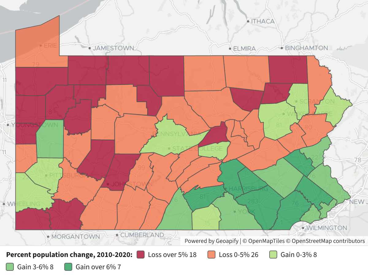
Statewide, Pennsylvania grew from 12,702,367 to 13,002,700 — a gain of 300,333 people (+2.4%). But that growth was very unevenly spread: 23 counties gained population and 44 lost it. Every county that grew is in the southeast, south-central, or a college/metro anchor; every county that shrank more than 5% is in the northern tier or western Pennsylvania.
 Pennsylvania County Population Change 2010-2020⬇ Image
Map legend — each county is shaded by its percent population change from the 2010 to the 2020 census (both on 2020 boundaries):
Color Class Dark red Loss over 5% (18 counties) Orange Loss 0–5% (26 counties) Light green Gain 0–3% (6 counties) Green Gain 3–6% (7 counties) Dark green Gain over 6% (10 counties) Click any county for its exact 2010 and 2020 populations, the change, and the percent change.
The ten biggest gainers and losers
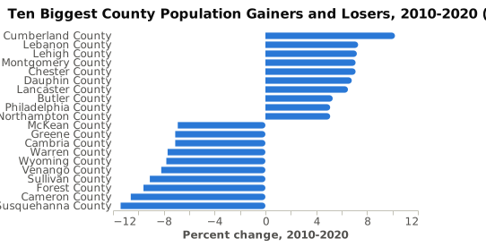
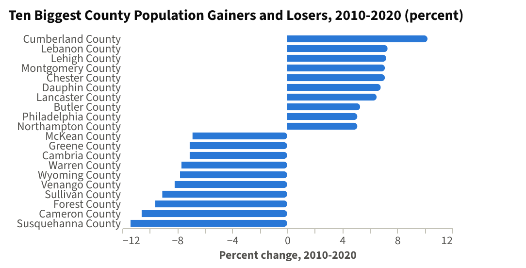
By rate of change, Cumberland County (Carlisle/Harrisburg west shore) leads at +10.2%, and the top of the list is dominated by the Philadelphia and Harrisburg metro rings — Chester, Montgomery, Dauphin, Lancaster, Lebanon — plus the Lehigh Valley (Lehigh +7.2%). At the other end, Susquehanna County fell −11.4%, the steepest decline in the state, followed by tiny Cameron (−10.6%) and Forest (−9.6%) counties and a band of western-Pennsylvania counties (Venango, Wyoming, Warren, Cambria, Greene).
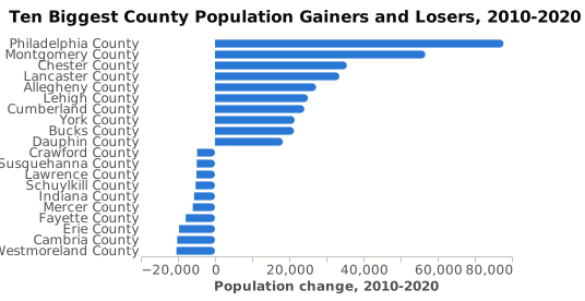
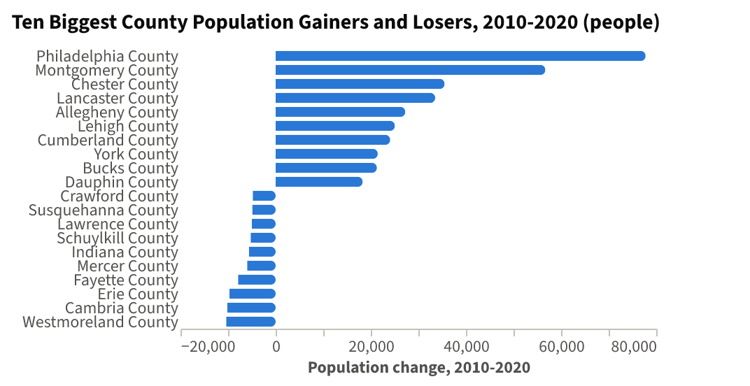
By number of people, the ranking looks different. Philadelphia County added 77,775 residents — by far the largest gain, more than Montgomery (+56,694) and Chester (+35,528) combined. The largest absolute losses are Westmoreland (−10,387), Cambria (−10,190) and Erie (−9,690), where declines are spread over a large base rather than concentrated in a small rural county.
What the pattern shows
- Growth is concentrated and metro-driven. The Philadelphia collar (Chester, Montgomery, Bucks, Delaware), the Lehigh Valley (Lehigh, Northampton, Berks), and the Harrisburg–Lancaster–York corridor (Cumberland, Dauphin, Lancaster, Lebanon, York, Adams, Franklin) account for most of the state's gain. Pittsburgh's Allegheny County (+2.2%) and State College's Centre County (+2.7%) also grew.
- Losses run along the northern tier and the old industrial west — Susquehanna, Wyoming, Sullivan, Potter, Cameron, McKean, Warren, Venango, Clarion, Lawrence, Mercer, Greene, Fayette, Cambria, Indiana, Armstrong. Susquehanna County's steep drop stands out because 2010 sat at the tail of the Marcellus Shale gas-drilling boom, which has since subsided.
- Small rural counties dominate the percentage extremes while large counties dominate the absolute ones — which is why the two charts disagree about who the "biggest" movers are. On a rate basis Philadelphia is only 10th; on a headcount basis it is first by a wide margin.
Data note: these are 100% decennial counts, not survey estimates, so there are no sampling margins of error. The 2010 figures are reported on 2020 block-group boundaries and a small share was apportioned (statewide average
est_share0.018); the county-level sums reproduce the official 2010 state total to within about a dozen people, so county totals are reliable. A handful of individual block groups were heavily apportioned, so block-group-level readings from 2010 should be treated more cautiously than these county aggregates.
Layers
- …
- …
- …
- …
- …
- …
Click anything on the map for its details.
The transcript is a Word document with every query the answer ran. Shapefiles of every layer, at full detail, can be downloaded in State Planner: sign up to ask your own question and export any map.