Ohio · September 26, 2026
NOACA Corridor Level of Service
This is a real answer State Planner produced from Ohio’s public data.
Start for free to ask your own version of this question, or anything else about your state.
Rank the congested corridors in the NOACA area around Cleveland by delay and vehicle hours travelled, and show the level of service on each.
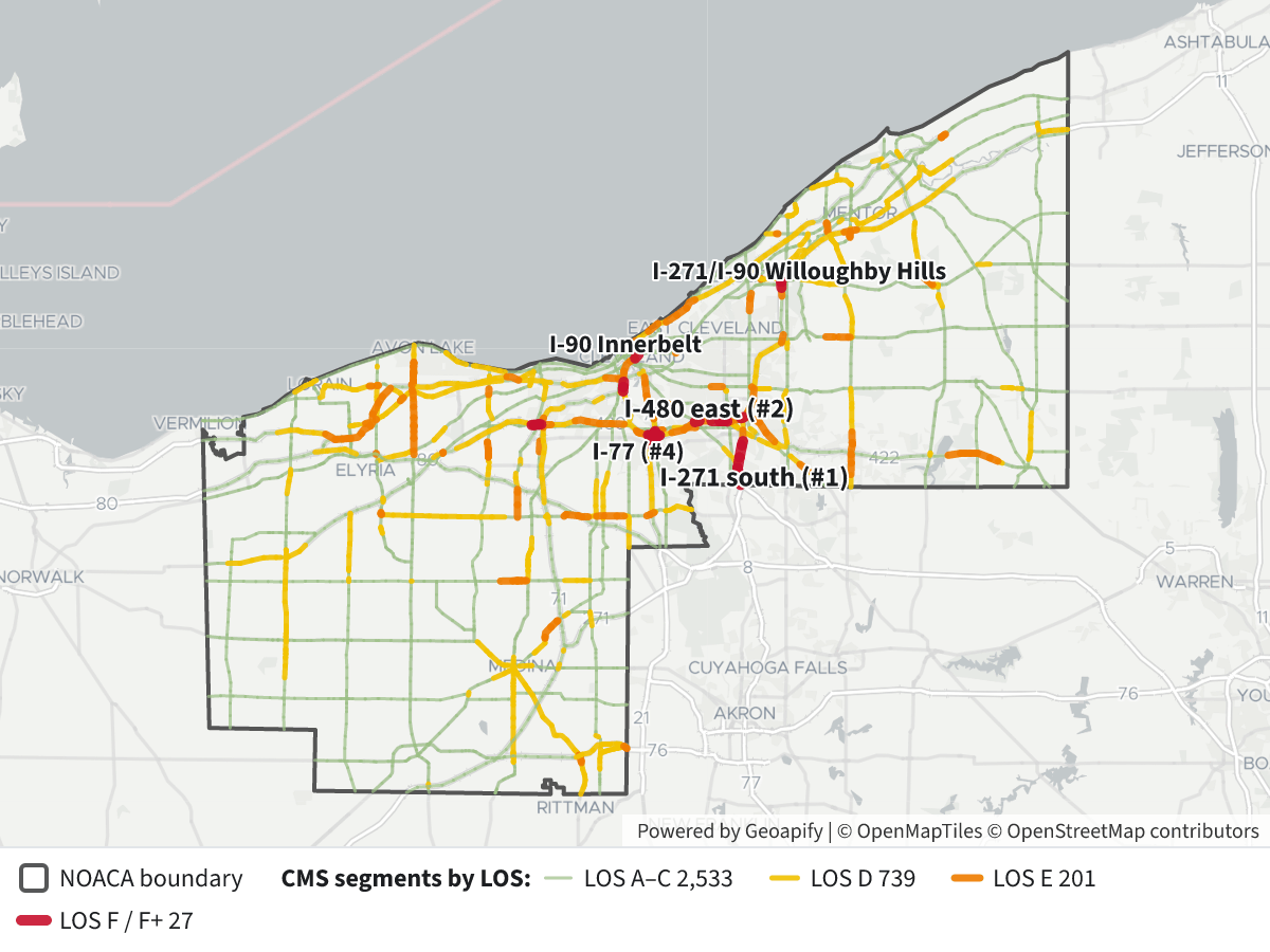
Now the map: every modelled segment in the five NOACA counties, coloured by LOS, with the MPO boundary drawn on top.
NOACA congested corridors, ranked by delay and vehicle hours travelled (VHT)
Source and method. All figures come from ODOT's statewide congestion model (the CMS Volume/Capacity layer). I treated NOACA as its five member counties (Cuyahoga, Geauga, Lake, Lorain, Medina) and treated each route as one corridor, adding up its model segments. Delay is the model's congestion delay: congested travel time minus free-flow travel time, in vehicle-hours. I left out "physical" and "speed-limit" delay because they measure road design, not congestion; on freeways they are often negative. These are modelled numbers, not measured speeds. Level of service (LOS) runs from A (free-flowing) to F (failing), plus F+ for the worst segments.
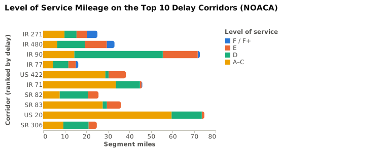
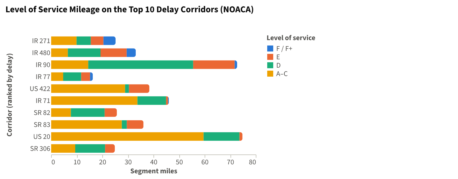
Delay rank Corridor Miles Congestion delay (veh-hrs) VHT VHT rank Worst LOS Miles at F/F+ Miles at E Miles at D Peak V/C 1 I-271 25.2 3,154 40,042 4 F+ 4.8 4.9 5.6 1.30 2 I-480 33.1 1,371 52,546 2 F+ 3.6 10.2 12.8 1.30 3 I-90 72.6 602 94,976 1 F 1.0 16.2 41.0 1.09 4 I-77 16.3 184 21,106 9 F+ 1.1 3.5 7.0 1.11 5 US-422 38.4 80 20,428 10 E – 8.0 1.5 0.94 6 I-71 46.0 78 46,384 3 F+ 0.3 0.8 11.2 1.13 7 SR-82 25.6 68 11,459 14 E – 4.8 13.2 0.84 8 SR-83 36.1 43 6,761 26 E – 6.5 2.0 0.95 9 US-20 74.8 35 29,730 5 E – 1.2 14.0 0.87 10 SR-306 24.9 28 8,628 20 E – 3.8 11.7 0.74 11 I-80 (Turnpike) 39.5 27 25,397 7 D – – 3.4 0.60 12 SR-3 34.3 25 8,817 18 E – 1.8 12.3 0.78 13 SR-254 15.1 21 5,823 31 E – 0.6 11.2 0.86 14 SR-176 13.1 21 7,424 23 F 0.4 – 5.0 1.09 15 SR-2 35.3 17 29,470 6 E – 1.0 10.8 0.83 The chart shows how many miles of each top-10 corridor fall into each LOS grade. I-271 and I-480 have the largest share of E and F miles. I-90 is mostly LOS D spread over a long route.
Findings
- Delay is concentrated in a few places. The top three interstates account for about 5,100 of the roughly 6,000 vehicle-hours of modelled congestion delay in the region. I-271 alone accounts for more than half.
- I-271 south of I-480 is the worst spot in the region. From the Summit County line north to about Bedford (county log 0.4–3.3) it runs at LOS F+ with a V/C ratio of 1.15–1.30 on 4–6 lanes. That stretch produces about 2,200 vehicle-hours of delay. The second I-271 hotspot is in Lake County near the I-90 merge in Willoughby Hills (LOS F+, V/C 1.30).
- I-480 on the east side, through Garfield Heights, Maple Heights and Warrensville Heights toward the I-271 junction (log 20.5–24.2), carries up to 165,000 vehicles a day at LOS F/F+.
- I-90 has the most VHT but ranks only third on delay. It carries the most traffic over the longest distance, and most of it runs at LOS D. Its one failing segment (LOS F) is the Innerbelt near downtown.
- Ranking by delay per hour travelled gives a different order. I-271 loses about 7.9% of its VHT to congestion, compared with 2.6% for I-480 and 0.6% for I-90. I-71, US-20, SR-2 and I-80 carry a lot of VHT but have very little congestion delay.
- Among non-freeway routes, US-422 (Solon/Chagrin corridor), SR-82 and SR-83 have the most delay, all at LOS E. SR-176 (Jennings Freeway) has a short LOS F stretch.
 NOACA Corridor Level of Service⬇ Image
Map legend
- Grey outline: NOACA MPO boundary.
- Green, thin: LOS A–C, uncongested.
- Yellow: LOS D, approaching capacity.
- Orange: LOS E, at capacity.
- Red, thick: LOS F or F+, over capacity.
- Click any segment to see its corridor, the corridor's delay rank, county log points, V/C ratio, AADT (average daily traffic), lanes, delay and VHT.
Caveats and alternatives
- I defined NOACA by its member counties. If you use the MPO polygon instead, a few edge segments in Summit and Huron counties come in, which slightly raises the I-271, I-480 and I-77 totals.
- Corridors are whole routes. I can split them into sub-corridors (for example, I-271 south versus I-271 in Lake County) or rank individual bottleneck segments if you prefer.
- If you want total delay rather than congestion delay alone, I can add physical delay back in. Doing so pushes long signalised routes such as US-20, SR-2 and US-42 much higher in the ranking.
Layers
- …
- …
- …
- …
- …
- …
Click anything on the map for its details.
The transcript is a Word document with every query the answer ran. Shapefiles of every layer, at full detail, can be downloaded in State Planner: sign up to ask your own question and export any map.